The Finance Edit
Full brand identity for a finance broker. Earthy rather than corporate, on purpose.
Brand identity · Finance broker
A mortgage and finance broker working with first home buyers, refinancers and investors, run by Diandra.
The brief was unusual, and it was the right one. Not make us look credible, which is what every finance brand asks for. It was: make people feel comfortable enough to come and talk to me. Particularly women, about a subject most of us were never taught and quietly feel behind on.
Diandra puts the problem better than I can. On her own site she says people rule themselves out far too early, and that she has lost count of the conversations with people who assumed they did not earn enough. That is the real barrier in this business. Not competition, not rates. Someone deciding not to ask.
So the identity had one job above all the others: lower the threshold on asking.
The direction
Finance branding has two settings and both raise the threshold.
The big end goes corporate. Navy, a serif wordmark, a skyline. It signals institution, which is exactly the thing that makes someone think they will take one look at me and say no. Every visual cue says this is a place with rules you do not know.
The other setting goes loud. Bright gradients, exclamation marks, folded arms. It signals hustle, which is the wrong register for the largest financial decision most people ever make.
The Finance Edit sits in neither, and the name is the clue. Edit belongs to magazines and wardrobes, not lenders. It carries curation and restraint, and the idea that your finances are something you shape rather than something you submit to. The identity had to earn that word instead of decorating it.
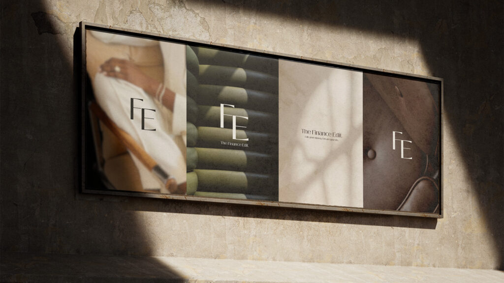
Earthy, not corporate. A muted sage green with warm neutrals, creams and soft browns underneath it. Nobody in this category looks like this, and that is most of the point. Blue is so universal in financial services that it has stopped meaning trustworthy and started meaning generic. Green and brown read as grounded and human instead, and they do something blue cannot: they make the brand feel like somewhere you could sit down rather than somewhere you get assessed.
Warmth was the brief, so warmth had to be structural. Not a friendly tagline sitting on top of a cold identity. The palette, the photography and the spacing all carry it, which is why it holds up when the brand is reduced to a single colour on an email signature.
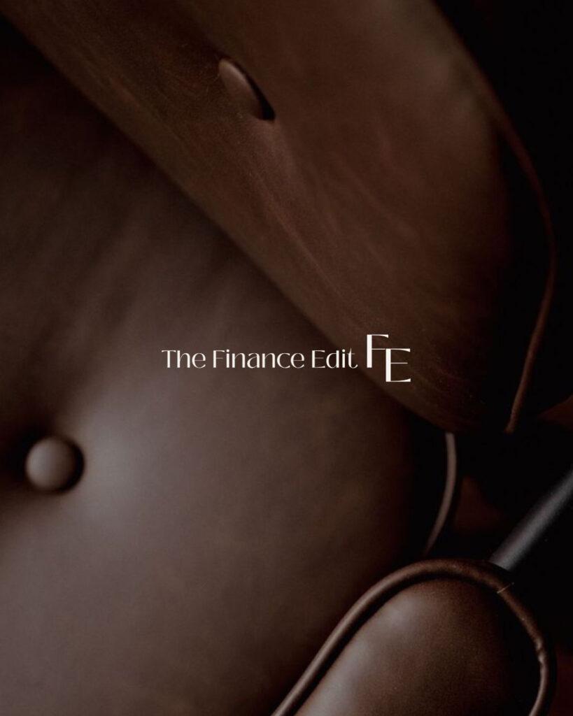
Lifestyle photography, natural light, a real person. No coins, no graphs, no handshake stock, no skyline. The imagery shows the outcome, a person in their life, rather than the mechanism. That is a positioning decision as much as an art direction one. It says the product is the life, not the loan, and it tells someone browsing at 11pm that there is a human on the other end of this.
A clean sans, set with room around it. A brand promising to make finance feel less overwhelming cannot itself be busy. Space is the part of the design doing the reassuring.
What I built

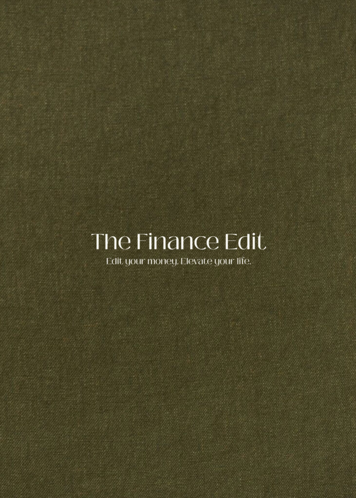
- The wordmark, set and spaced to hold at the two sizes that actually matter: an Instagram avatar and an email signature. Most broker logos fail at the first.
- The colour and type system, with defined roles rather than a swatch page, so every future piece has an answer instead of a decision.
- Embossed business cards. A broker’s card is handed over at an open home, at a kitchen table, at the end of a long conversation about a lot of money. Emboss is felt before it is read, and a card someone wants to keep hold of is doing warmth and credibility at the same time.
- The wider stationery and collateral, so the brand arrives consistent whether it comes by email, by post, or in person.
The hard part: warm, and still competent
Warmth is easy to do badly in financial services. Go too far and it reads as unqualified, which is worse than cold, because now someone is being asked to trust you with a mortgage by a brand that looks like a wellness studio.
So every decision had a second test. Enough warmth that a first home buyer feels able to ask the question they think is stupid. Enough restraint that an investor with a portfolio does not feel patronised. The same identity has to hold both of those people, and most brands in this category solve it by picking one and losing the other.
The resolution was to spend the distinctiveness in two places and keep everything else quiet. Earth tones where the whole category is navy, and a card you can feel. Around those, the system is deliberately calm: generous spacing, a plain sans, nothing decorative that a compliance line could not sit beneath.
Quiet is not timid here. Quiet is what makes the warmth believable.
Why it was worth getting right
A broker’s entire advantage over a bank is that you can call them and a person answers.
If the brand looks like a bank, that advantage is invisible before anyone reads a word, and the person who assumed they do not earn enough closes the tab. Every design decision in this project was aimed at the few seconds before that happens.
That is not decoration. It is the difference between someone making contact and someone deciding not to.
Client feedback:
I needed branding for my finance brand. Lorena was amazing – She brought my vision to life perfectly. The process was easy and she understood my needs.
Services: Brand identity · Logotype and wordmark · Colour and type system · Embossed stationery · Print collateral