Lou’s
Lou’s is an Italian and French inspired neighbourhood restaurant with a warm, timeless identity designed to feel familiar and full of character.
Brand Identity · Hospitality · Restaurant
Lou’s is a neighbourhood restaurant bringing together Italian and French influences in a space designed to feel warm, familiar and established. The kind of place that feels like it has always been there.
The brief was to create an identity that avoided the expected visual language of modern European dining. Rather than feeling overly polished, minimal or trend led, Lou’s needed character. Something timeless, slightly nostalgic and confident enough to feel established from day one.
The direction
Not new. And not trying to look new.
The identity was built around the idea of a restaurant that could have opened decades ago and simply never needed to change.
Rather than leaning into the clean, minimal aesthetic often seen across contemporary Italian restaurants, or going too far into traditional red, green and script typography, the direction sits somewhere in between.
A deep forest green became the foundation of the palette, paired with a hand lettered logotype and custom chef illustration. Together, they give Lou’s a sense of history and personality without turning the brand into a theme.
The green was selected early in the process because it needed to work across every part of the restaurant. It is dark enough to hold gold detailing, strong enough to reverse out in white across signage and glass, and understated enough to sit alongside food photography without competing with it.
The identity
At the centre of the brand is a custom hand lettered logotype.


Rather than setting the name in an existing typeface, the lettering was developed specifically for Lou’s, retaining subtle irregularities that make the mark feel more personal and established.
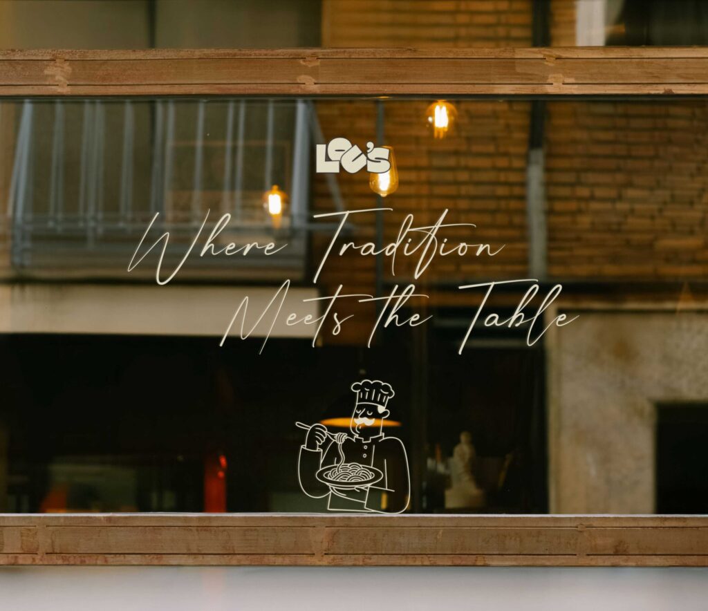
Alongside it sits a custom chef illustration, drawn using a simple continuous line style. The illustration introduces personality without overwhelming the identity and was intentionally kept simple enough to reproduce across embroidery, print, signage and digital applications.
Together, the two elements create a flexible identity system rather than a logo that only works in one format.
Bringing Lou’s to life
The identity was developed across the key customer touchpoints of the restaurant.
The shopfront and window graphics were designed specifically for glass, considering how the branding would be viewed from the footpath and at different angles as customers approached the restaurant.
The menu system carries the same restrained visual language into the dining experience, using the deep green palette, typography and spacing to create something that feels considered without distracting from the food.
The identity was also extended into embroidered apparel and branded collateral, allowing the same visual language to move naturally across the restaurant.
Every application was considered as part of the wider brand rather than treated as an individual piece.
Designed for the surface
Hospitality branding has to work far beyond a screen.


Fine details that look beautiful on an artboard can disappear when embroidered. Gradients become difficult to reproduce in vinyl. Lettering that works at a large scale can become unreadable when reduced.
For Lou’s, each element was designed with its final application in mind.
The chef illustration uses simplified linework so it can translate cleanly into embroidery and vinyl. The logotype has enough weight to remain recognisable across signage, menus and smaller collateral. The colour palette was selected to reproduce consistently across print, fabric, glass and digital environments.
The result is an identity designed as a complete restaurant system, not simply a logo placed onto mockups.
The outcome
Lou’s feels established without feeling dated, European without relying on clichés, and considered without becoming overly polished.
From the shopfront to the menu, embroidery and printed collateral, every element belongs to the same visual world.
The identity gives Lou’s something a neighbourhood restaurant needs more than novelty: familiarity, character and the feeling that it belongs exactly where it is.
Services
Brand Strategy · Brand Identity · Logo & Logotype Design · Custom Illustration · Signage & Window Graphics · Menu Design · Print Collateral · Brand Applications
