Project scope: Full brand identity signage website design & ongoing support
Commercial & Industrial Real Estate
Nexa Commercial
Nothing existed yet that a landlord or a tenant would take seriously.
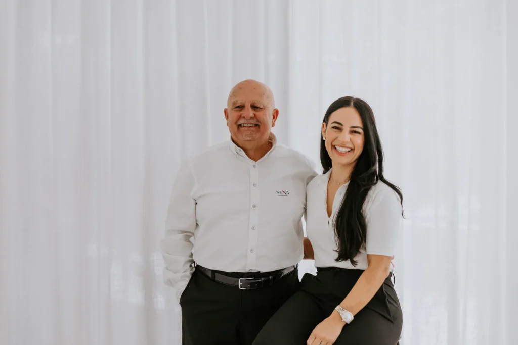
Sam Bruzzese and Carla Bruzzese Ackaoui were opening a commercial and industrial property agency, and they needed the brand before the doors. From day one they would be pitching landlords against firms with a hundred staff and forty years of letterhead behind them.
The direction
Commercial property looks the same everywhere. Navy, grey, and a glass tower shot from below. Building a smaller version of that was the losing move, because a smaller version of a big agency just reads as a less experienced one.
NEXA went near black, white and a single deep red, with one geometric sans doing all the work. The X in the wordmark is two strokes crossing, one black and one red, which is what a deal is. Two parties meeting at a point.
The red earns its place off screen. The most seen asset in this business is a board wired to a fence on an industrial road, read at sixty kilometres an hour by someone who is driving. Navy disappears against grey tilt slab under a grey sky. The red does not.

What I built
The logo and wordmark with the variations real use demands: a small lockup that still reads on a board photographed from a moving car, and a full mark for documents and the site. Then the system around it, so type, palette and usage are written down and anyone can follow them.
Then everything the agency hands people. Listing brochures and property flyers, for lease and for sale boards, email signatures, letterhead, social templates and business cards.
The documents that win the work
An agency does not win a listing with a logo. It wins it with the document it leaves on the table, sitting next to two others from firms ten times its size.
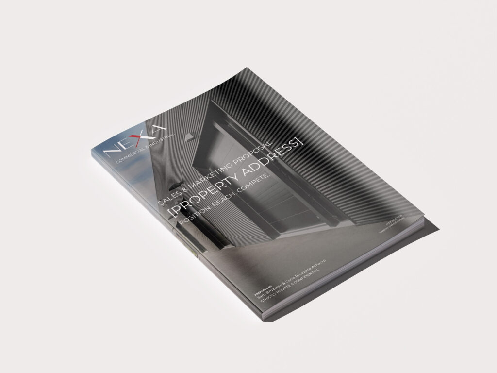
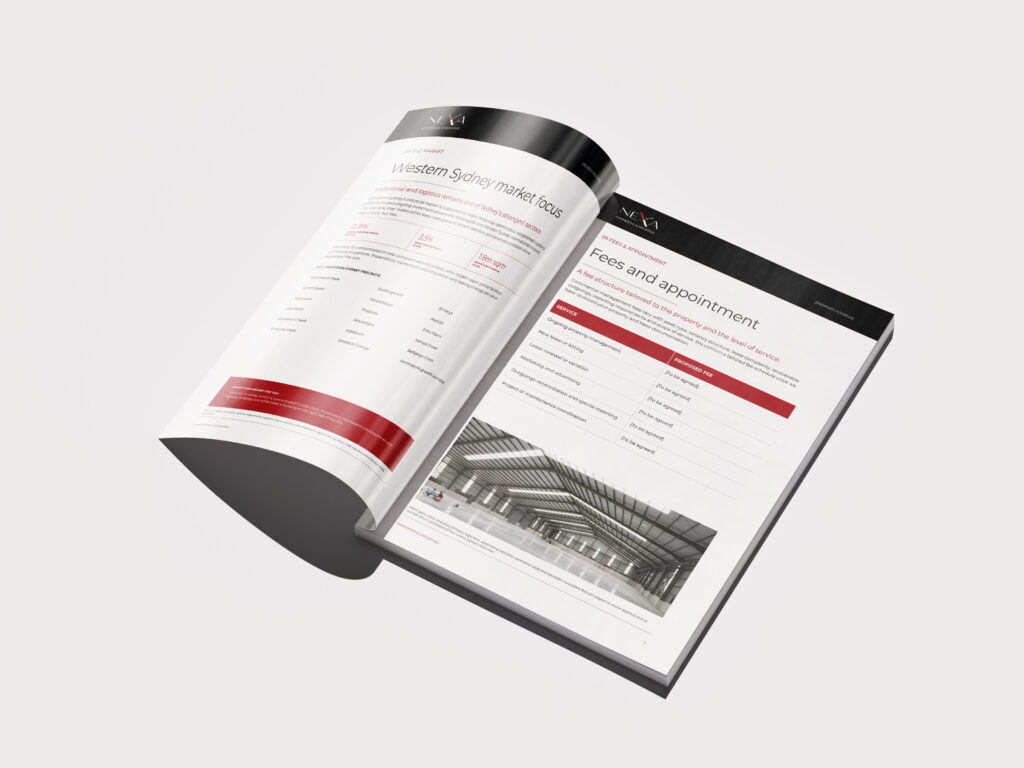
Two proposals, fourteen pages each, on the same twelve section spine. A sales and marketing proposal for a listing campaign, and a property management proposal for the portfolio side. Same covers, same contents page, same typography, so a landlord who receives both receives one agency twice rather than two documents from the same office.
Both are templates. Every property specific line sits in brackets, so Sam and Carla drop in the address, the numbers and the evidence, and it still comes out looking like NEXA. Inside, the red does structural work and nothing else. Section numbers, rules, one callout bar a page. The rest is black on white, so the eye lands on the figures, which is what the reader opened it for.
That is the argument for building a system instead of a logo. They can send a proposal tomorrow without calling me.
The website
The site runs on GoDaddy’s builder, and that was the right call rather than a compromise. An agency whose listings change weekly needs a site its own people can edit on a Tuesday afternoon without booking anyone. The brand work is what stops a template looking like a template. Knowing when a client needs a custom build and when they do not is part of the job.
Lorena created our website and played an incredible and significant role in launching our business. Her vision and ideas are truly out of this world, and her communication and attention to detail were outstanding. She brought our brand to life better than we ever imagined!
Carla & Sam
The result
NEXA launched with all of it in place. The brand, the collateral and the site were finished before the agency opened, which meant their first pitch to a landlord was made by a firm that looked like it had been trading for years.
Services
Services: brand identity, logo design, website design, print and marketing collateral.